That is a great idea and I thought I did haha.
Here it is.
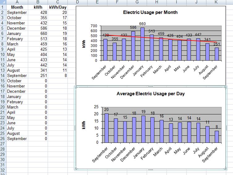
Since posting, I've added some additional and nice features to the spreadsheet. I now graph the electric usage, gas usage, and the total (combined) usage in kWh.
I would like to incorperate the heating degree days and cooling degree days into the chart somehow too to show that X month was significantly hotter or cooler than Y month. Just haven't gotten that far yet.
Ideas are quite welcome.